.png)
Search for elements, and add them to the page
The element library includes a wide range of designed elements, from simple shapes to complex user interfaces.
Browse Element Library
To browse the element library, navigate to the Left Sidebar and click on the Elements tab. The tab will be highlighted, and open the Elements panel.
As you scroll down, you will see the Element set grouped into Categories. These categories are collapsible, and you can hide or show that section by clicking on the category name.
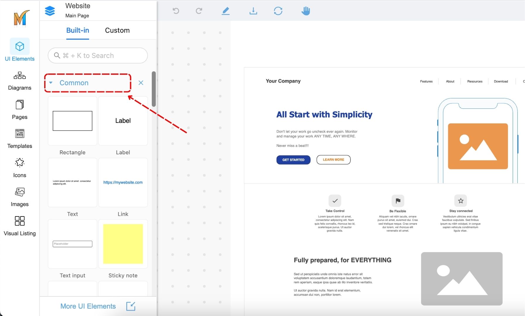
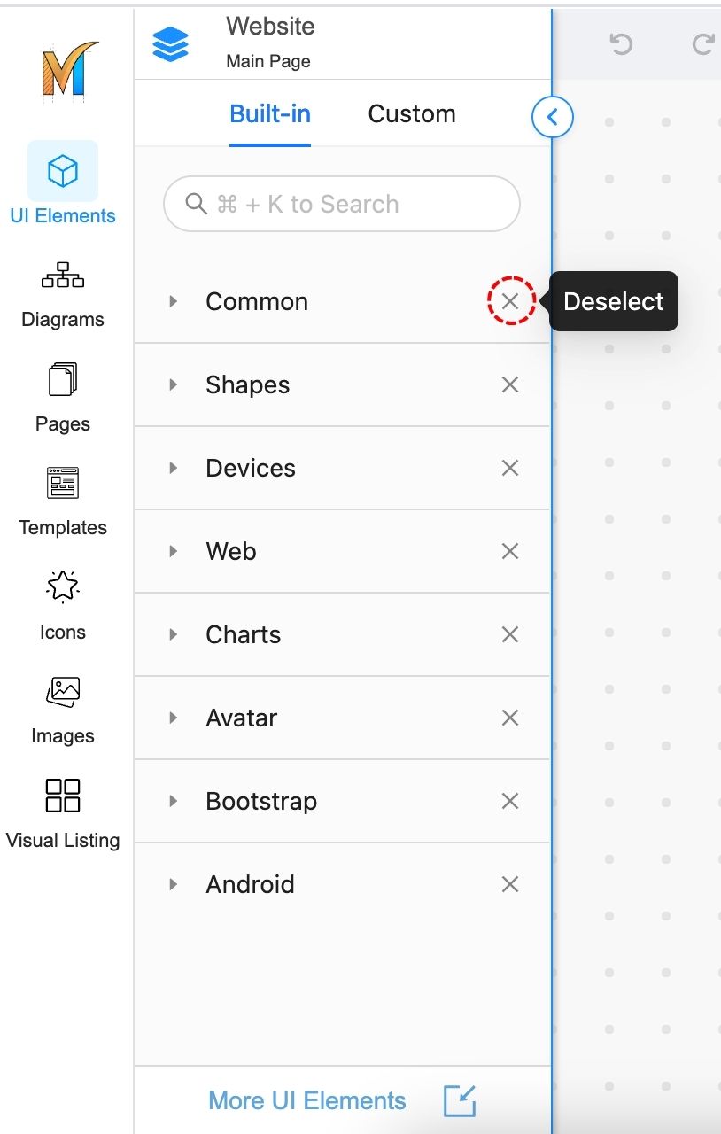
Or, you can also deselect a specific category by clicking on the X button and removing it from the panel.
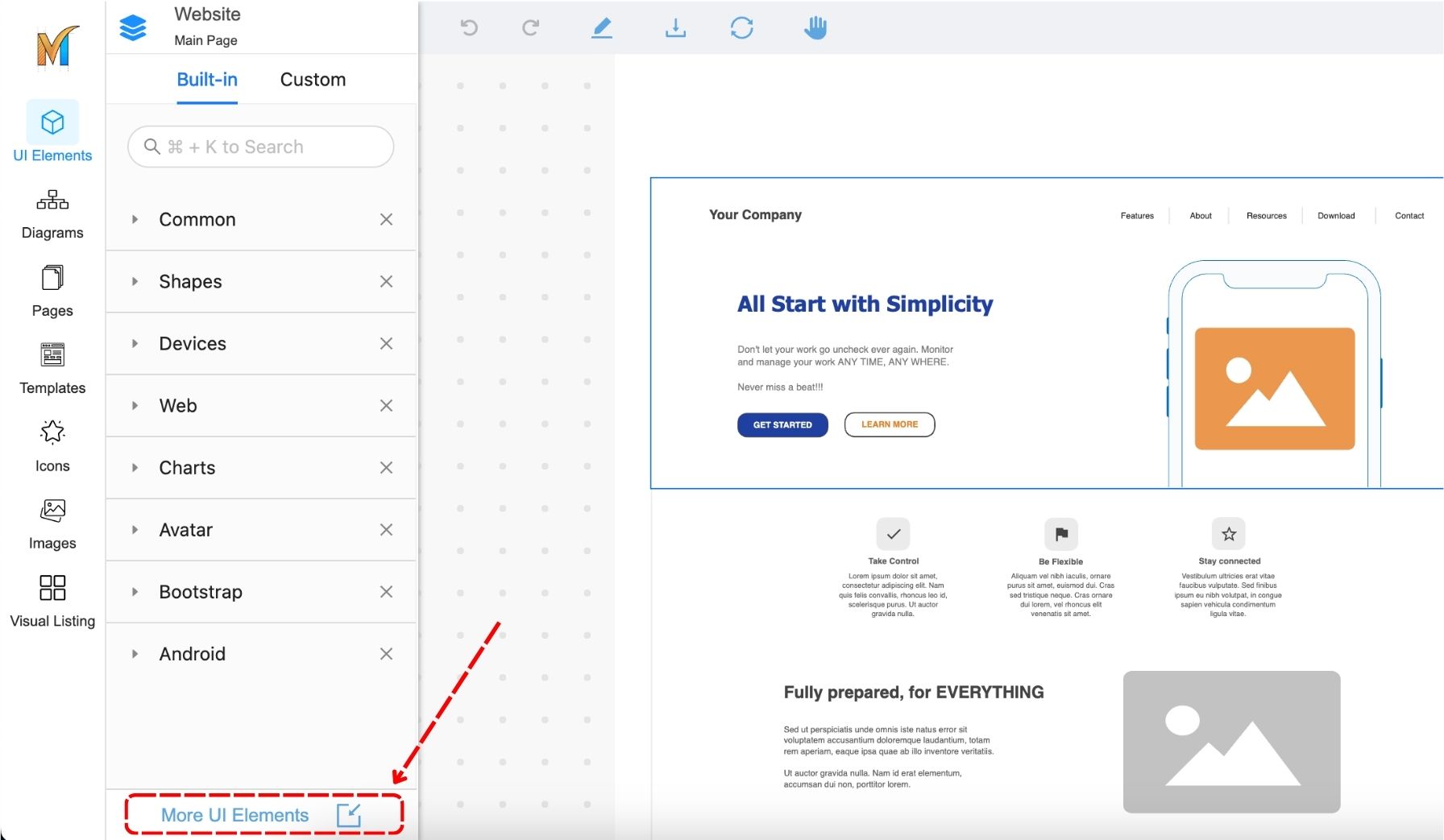
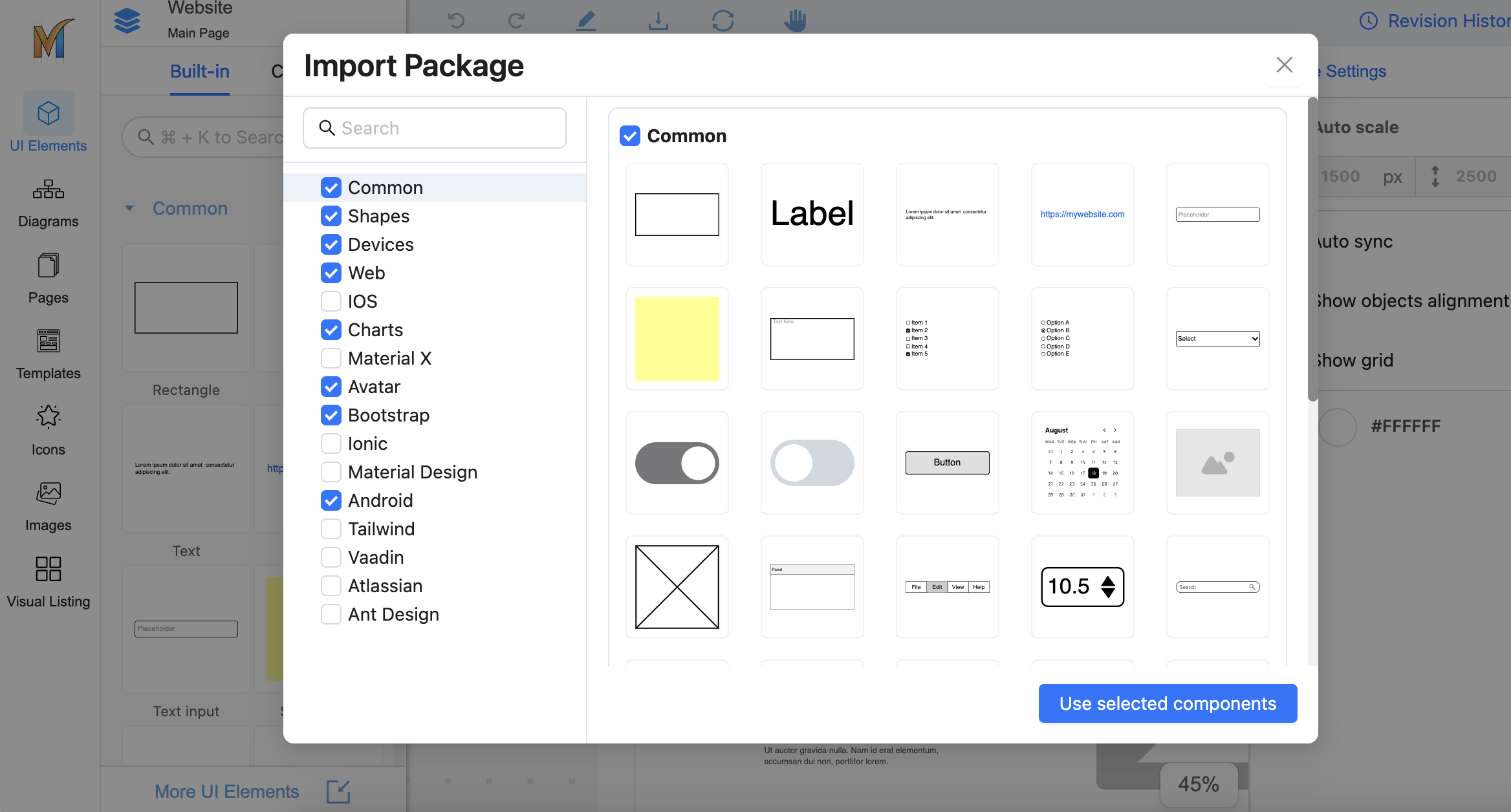
Import component packages
Mocky offers a rich selection of component packages, such as Tailwind, Material Design, and more, that you can import from.
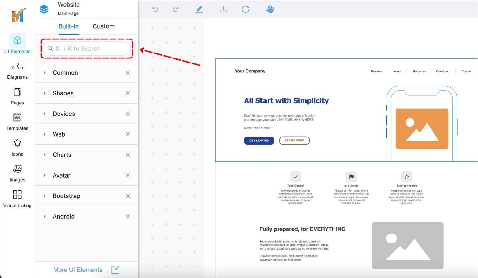
Search Elements
To search elements, use the search box at the top of the Elements panel. Search will show the results of all the filtered categories
Ctrl/Cmd + K to directly switch to the search box
Add Element to a Page
From the Elements panel, you can drag an element to a desired location on a page to add that Element.
-20231031-034510.jpg?cb=2b7464d969e421c12d762cbc2375b7ab)