.png)
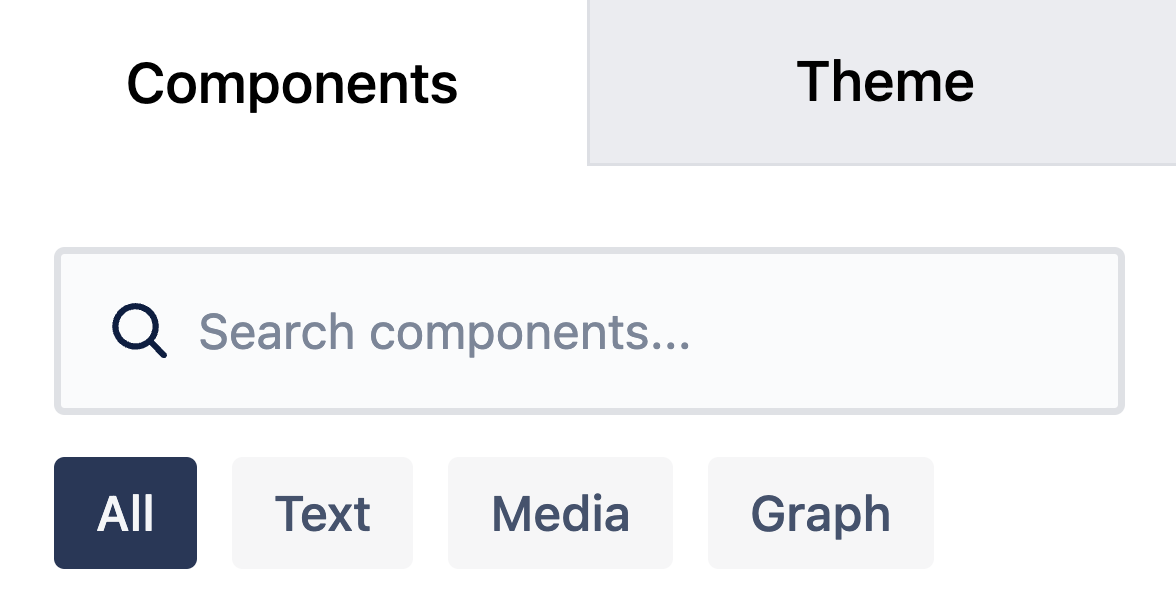
The components panel appears on the left side of the persona editor. You can collapse or expand the panel, or move it to the right or left using the icon buttons.
To build your persona, simply drag and drop components onto the board.
Components are grouped into three categories:
-
Text: Title & Content, Text Only, Tag, Demographic
-
Media: Avatar, Image
-
Graph: Continuous slider, Balance slider
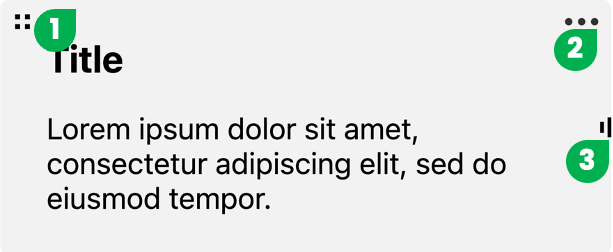
When you hover over a component, you’ll see three options:
-
Drag to move the component on the board
-
Access component settings
-
Resize the component
Component Details
-
Avatar: Upload a persona image (max 2MB), enter a name, and add sub-content. You can toggle the visibility of the name and sub-content in the settings.
-
Image: Upload an additional image for the persona (max 2MB).
-
Title & Content: Add a title with a paragraph for detailed descriptions.
-
Text Only: Add a text-only content block.
-
Tag: Highlight key points or keywords for the persona. Tags also appear in the Persona hub.
-
Demographic: Display and edit characteristics like age, gender, marital status, income, and occupation.
-
Continuous Slider: Add a slider to select a value along a range. You can add more options to the slider.
-
Balance Slider: Show the ratio between two opposing attributes. Additional options can be added as needed.
These flexible components let you customize each persona to match your project’s needs and capture the details that matter most.